Fritura
About the Font
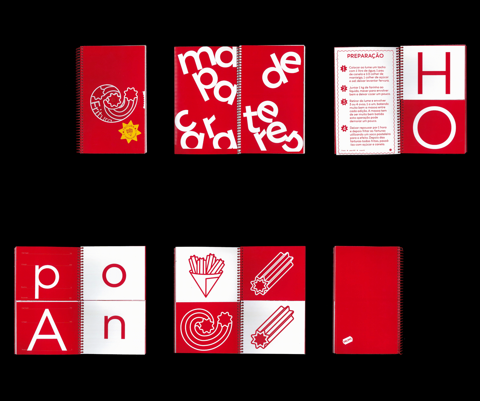
The design of this typeface is inspired by Tia Lira (Manuel Pereira da Silva, 2004) combined with Futura (Paul Renner, 1927). Fritura was created with the goal of being a Portuguese and “free” version of Futura. It is a geometric sans-serif typeface with a variable weight range from light to bold.
The letters are straight, and their strokes are monolinear. From Tia Lira, it inherits clean lines, simple geometric shapes, and clear legibility. Dressed in the Portuguese spirit of farturas (a traditional festival treat), Fritura features details that break the simplicity of the letterforms, reflected in certain characters and alternate glyphs.
Ana Leite is a graphic designer with a postgraduate degree in Graphic Design and Editorial Projects (2024) and a bachelor’s degree in Communication Design (2022) from the Faculty of Fine Arts of the University of Porto (FBAUP).
She works as a senior technician in the Communication Services at FBAUP and as an independent graphic designer for the Faculty of Architecture of the University of Porto, the Conservatory of Arts of Felgueiras, Galeria do Sol, and Edições Afrontamento.
Currently, she is an ambassador and event producer for the feminist platform “Ladies, Wine & Design, Porto.”
She co-founded the multidisciplinary art collective and co-working space Entretanto (2023–24) and the art collective 0porcent0 (2020–22).
She won the student visual identity competitions “RESET – Redesigning Equality and Scientific Excellence Together” (2021) and “R-VES – Rede de Voluntariado no Ensino Superior” (2021).
Her editorial project A nostalgia é uma borracha mágica para verdades atrozes (2020) was featured in the magazine Beyond Design (2024) by Sandu Publishing.
Daniel de Sousa is a designer and engineer by training, but his path has been shaped primarily by letter design. Early in his career, he was mentored in lettering by figures such as Martina Flor, Dan Forster, and Robert Bree—an experience that solidified his passion for typography as the core discipline of his practice. In 2023, he expanded his work as an independent designer, collaborating on visual identity projects for brands in the fields of culture, sports, and design.
He is currently completing a Master’s in Graphic Design and Editorial Projects at the Faculty of Fine Arts of the University of Porto (FBAUP). Within this context, he is part of the R-Typography team under the guidance of Rui Abreu, where he contributed to the Montris type family and conducts research on the expansion of type families into condensed widths.
Rita Vieira (2000, Porto) is a visual artist, designer, and researcher. She is currently pursuing a Master’s in Graphic Design and Editorial Projects at the Faculty of Fine Arts of the University of Porto (FBAUP), where she also earned a degree in Fine Arts (2023). In 2024, she was a research fellow at ID+ Research Institute for Design, Media and Culture. From 2019 to 2024, she was an active voice in student associations. She currently collaborates with the Library and Archive Services of FBAUP.
Her interdisciplinary practice is grounded in the intersection of multimedia and editorial design, where she explores the fusion and coexistence of image and text, pushing the boundaries of the book as a medium. Influenced by her interest in cinema, her projects often incorporate visual languages such as moving image, video, and photography, with a strong focus on dynamism, interaction, and motion.
Characters
Basic Characters
A
B
C
D
E
F
G
H
I
J
K
L
M
N
O
P
Q
R
S
T
U
V
W
X
Y
Z
a
b
c
d
e
f
g
h
i
j
k
l
m
n
o
p
q
r
s
t
u
v
w
x
y
z
Accented Characters
À
Á
Â
Ã
Ä
Å
Æ
Ç
È
É
Ê
Ë
Ì
Í
Î
Ï
Ð
Ñ
Ò
Ó
Ô
Õ
Ö
Ø
Ù
Ú
Û
Ü
Ý
Þ
ß
à
á
â
ã
ä
å
æ
ç
è
é
ê
ë
ì
í
î
ï
ñ
ò
ó
ô
õ
ö
ø
ù
ú
û
ü
ý
þ
ÿ
Đ
đ
ı
Ł
ł
Œ
œ
Š
š
Ÿ
Ž
ž
Figures
0
1
2
3
4
5
6
7
8
9
Punctuation and Symbols
.
,
;
:
!
?
¿
¡
+
−
-
=
×
÷
%
‰
±
§
¶
•
…
†
‡
$
¢
£
¤
¥
€
"
'
‘
’
‚
“
”
„
(
)
[
]
{
}
<
>
‹
›
«
»
#
@
^
&
|
\
/
⁄
_
`
~
¬
¦
¯
©
®
™
¨
´
¸
ˆ
ˇ
˘
˚
˛
˜
˝
ƒ
μ
fi
fl
ı
Ł
ł